In the realm of wearable art, jewelry design relies on the same foundational principles that govern architecture, sculpture, and painting. Among these principles, contrast stands out as the primary engine of visual impact. Without contrast, a piece of jewelry risks becoming monotonous, blending into a singular, uninspired mass where beautiful individual elements lose their identity.
Contrast is the deliberate juxtaposition of opposing elements to generate visual tension, establish a clear focal point, and direct the human eye across a composition. When a jeweler places two conflicting properties side by side, both elements are heightened, making the entire piece more dynamic and memorable. By mastering the interplay of light and shadow, texture, color, and form, designers transform raw materials into striking statements that capture attention from across a room.
The Play of Light and Shadow through Surface Texture
One of the most sophisticated methods for introducing contrast into a jewelry piece is through the manipulation of surface finishes. Metals such as gold, silver, and platinum possess an inherent reflectivity, but how a designer treats that surface dictates how the piece interacts with light.
High-Polish Versus Matte Finishes
Placing a mirror-like, high-polish finish directly adjacent to a deeply matte, brushed, or sandblasted surface creates a captivating visual boundary. The high-polish surface reflects the environment, catching sharp glints of light that immediately draw the eye. Conversely, the matte surface absorbs light, providing a soft, velvety backdrop that grounds the composition. This juxtaposition prevents a piece from looking overly flashy while ensuring it does not appear dull or flat.
Organic Fractures and Controlled Geometry
The contrast between rough, organic textures and clean, mechanical lines adds an intellectual layer to jewelry design. Designers often pair smooth, highly geometric metal wire with raw, unpolished, or heavily hammered elements. The chaotic, multi-faceted texture of a hammered surface creates a dance of micro-shadows that emphasizes the pristine, mathematical perfection of the surrounding polished borders.
Chromatic Conflict The Strategic Use of Color
Color contrast is perhaps the most immediate way to capture a viewer’s attention. In jewelry design, this is achieved through the careful selection of contrasting gemstones, the pairing of dissimilar metal alloys, or the application of modern materials like ceramics and enamel.
Complementary and High-Value Gemstone Pairings
Designers frequently look to the classic color wheel to generate maximum chromatic tension. Placing complementary colors, which sit opposite each other on the wheel, side by side creates a vibrant visual vibration.
-
Pairing deep blue sapphires with fiery orange spessartite garnets forces both stones to appear more saturated than they would in isolation.
-
Combining rich green emeralds with deep red rubies offers a timeless, regal contrast.
Beyond color hue, value contrast, which is the difference between light and dark tones, plays a critical role. Setting a bright white diamond against a backdrop of black onyx, dark rhodium plating, or blackened titanium creates a stark, graphic silhouette. The darkness of the background absorbs light, forcing the diamond to flash with greater perceived brilliance.
Bi-Metal Compositions
The deliberate mixing of distinct metal colors, once considered a design faux pas, has become a hallmark of contemporary jewelry. Combining warm tones like rose or yellow gold with cool tones like white gold, platinum, or oxidized sterling silver breaks up the visual monotony of a single metal. The transition zone where the two metals meet acts as an organic line of demarcation, defining the structure and architecture of the piece.
Structural Dichotomy Alternating Form and Scale
Visual impact is also driven by the physical architecture of a piece of jewelry. By playing with scale, shape, and weight, a designer can create a compelling narrative within a single necklace, ring, or pair of earrings.
Geometric Versus Organic Form
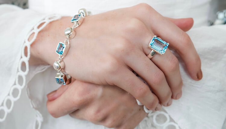
The human brain is naturally drawn to anomalies in patterns. When a jewelry design features rigid, angular geometry, such as clean rectangles, sharp triangles, or perfect circles, introducing a fluid, organic element creates an instant focal point. For example, a baroque pearl, with its irregular, unpredictable shape, becomes incredibly striking when suspended from a rigid, mathematically precise torque necklace. The natural asymmetry of the pearl challenges the perfection of the metal, creating a balanced aesthetic tension.
Mass and Negative Space
Contrast is not just about what is physically present; it is also about what is missing. The relationship between solid, heavy metal masses and open, airy negative space can dictate the mood of a piece. A massive, wide cuff bracelet can be rendered visually lightweight and intriguing by incorporating laser-cut filigree or open geometric cutouts. This interplay allows the wearer’s skin to show through, serving as an additional contrasting color and texture that completes the design.
Material Juxtaposition Elevated Preciousness Meets Everyday Utility
Modern jewelry design has expanded far beyond the traditional boundaries of precious gems and metals. Today, visual impact is routinely achieved by pairing high-value materials with industrial or unconventional substances.
Precious Gems Set in Industrial Mediums
One of the most revolutionary movements in contemporary jewelry involves setting traditional, brilliant-cut diamonds or high-grade emeralds into non-traditional materials like concrete, carbon fiber, wood, or rubber. The raw, utilitarian nature of carbon fiber or concrete contrasts sharply with the refined luxury of a faceted gemstone. This technique strips the gemstone of its traditional, formal context, creating a rebellious, modern statement that challenges the definition of intrinsic value.
Rough and Faceted Materials
Even within the world of natural gemstones, designers find contrast by pairing different states of the same material. Setting a fully faceted, brilliantly sparkling crystal next to a rough, mineral specimen of the same stone creates a beautiful timeline of transformation. The crystalline, geometric facets highlight human craftsmanship, while the rough, unpolished matrix celebrates the raw power of nature.
Frequently Asked Questions
Why does a diamond look brighter when set in a dark or blackened metal?
This phenomenon relies on value contrast. When a white diamond is surrounded by a highly reflective white metal, the light bouncing off the metal blends with the light refracting from the stone, reducing the stone’s distinct outline. When set in a darkened metal like black rhodium or oxidized silver, the dark background absorbs ambient light completely. This isolation forces the human eye to focus entirely on the light escaping from the diamond, making its fire and brilliance appear significantly more intense.
How can a designer use contrast to make a small gemstone look larger?
A designer can manipulate scale contrast to alter perception. By surrounding a small, delicate gemstone with large, sweeping expanses of smooth, unembellished metal, the gemstone acts as a sharp focal point, drawing the eye inward. Alternatively, micro-pave borders consisting of tiny diamonds can be set around a modest central stone, creating a contrast in texture that tricks the brain into viewing the entire cluster as a single, large, cohesive unit of sparkle.
Is there a risk of creating too much contrast in a single jewelry design?
Yes, excessive contrast can lead to visual chaos. If a piece incorporates conflicting colors, contrasting textures, varying shapes, and mismatched scales all at once, the eye becomes overwhelmed and cannot find a place to rest. To achieve successful visual impact, a designer must choose one or two primary methods of contrast to serve as the hero of the piece, while keeping the other design elements relatively unified.
What role does contrast play in the comfort and wearability of a piece of jewelry?
While contrast is primarily a visual tool, it also translates to the tactile experience of wearing jewelry. A piece that features sharp, geometric outer lines can be crafted with a smooth, heavily contoured, and rounded interior. This structural contrast ensures that the jewelry projects a bold, aggressive aesthetic to the world while remaining soft, ergonomic, and comfortable against the wearer’s skin.
How does color contrast change depending on whether a gemstone is translucent or opaque?
Translucent or transparent gemstones, like aquamarines or amethysts, rely on internal light reflection, which means their color contrast shifts dynamically as the wearer moves and light passes through them. Opaque gemstones, like lapis lazuli, turquoise, or malachite, present a solid, unchanging block of color. Pairing a translucent stone with an opaque stone creates a contrast not just in color, but in depth, mixing surface-level color reflection with deep, internal refraction.
Why is the contrast between symmetry and asymmetry so powerful in earrings?
The human face is naturally evaluated based on symmetry. When a person wears mismatched or asymmetrical earrings, it disrupts expected visual patterns. If one earring features a long, linear drop and the other is a short, concentrated cluster using the same materials, it creates a powerful contrast that forces the viewer to look closer. The shared materials provide unity, while the contrasting silhouettes create a dynamic, modern frame for the face.